
I’m curious what you Android users think of the Android vs Apple theme for the Voyager app.
- Which one do you prefer?
- Which one do you think should be the default for new/novice users? Why?
This would be the default, but don’t worry, you will always be able to choose. I would also like to note that in the future Voyager will have a Material 3 theme, but not yet!
Thanks for your help!
———
Edit: thanks everyone for the feedback. I think I’ll probably make android the default theme on android for new users.
Yes, the apple theme was initially off-putting to be honest and I doubt most casual users take the time to check out the settings before looking elsewhere. First choice should always be (imo) the most familiar/comfortable for users.
Oh my god I had no idea there was a device selection and the Android one feels so much better. Please keep it as the default for new Android users.
I’ve been using the Android theme for a while and wouldn’t go back. It makes no sense trying to make a Android app look like a iOS app.
Do you mean the “Device Mode” option in the Appearance settings? I’d say Android should be default on Android. It feels more at home/in line with other Android apps I’m used to.
I almost skipped over the app entirely because of the iOS skin, when I open an app that’s themed like iOS it makes me doubt the quality of experience I’ll have with the app because it feels like android must not be a priority. I saw enough people recommending it though and it’s a good app so I found the setting eventually lol.
While you’re reading I’d love an option to stretch the app content like post titles and comments to the full width on a foldable or tablet, it’s kinda weird it just sits there in the middle of my screen. It’s not a big deal though.
I use the Android skin, and am happy with it, despite it being marked as beta. I think that having the native feel is important, even if it’s not quite as polished.
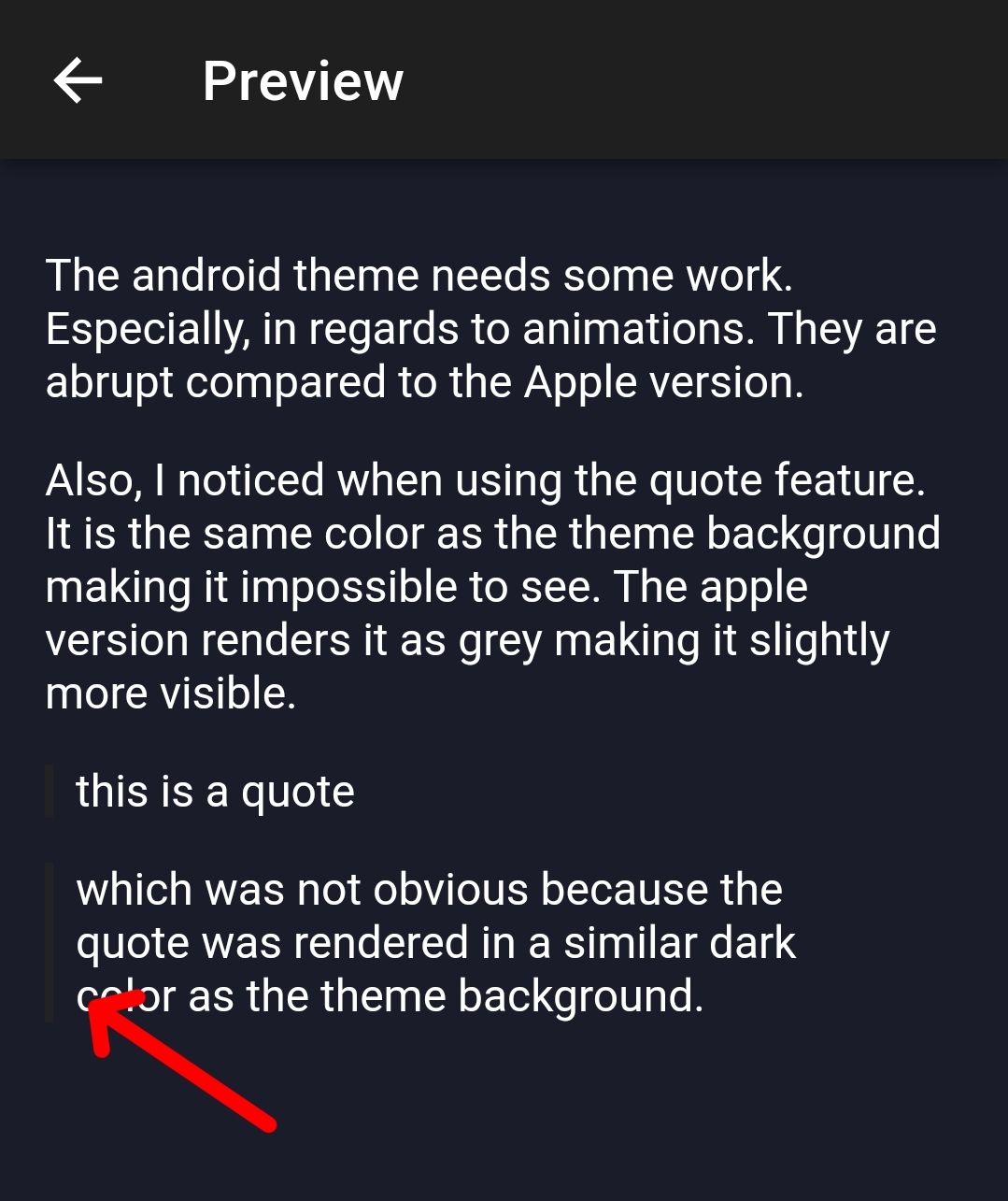
The android theme needs some work. Especially, in regards to animations. They are abrupt compared to the Apple version.
Also, I noticed when using the quote feature. It is the same color as the theme background making it impossible to see. The apple version renders it as grey making it slightly more visible.
this is a quote
which was not obvious because the quote was rendered in a similar dark color as the theme background.
Thanks, I found the issue with the quote color, should be comparable to iOS shortly.